This is the final Time in the Woods spread. I like the composition overall and I think the colors are vivid and play well off each other. I didn't want to clutter the spread with an overwhelming amount of photography so I cropped the bottom and made the pictures smaller. I think it turned out much better than I thought it would
My daily design challenges as a Visual Communications student and assignments from VCII and Illustration.
Wednesday, October 28, 2009
Time in the Woods.
This is the final Time in the Woods spread. I like the composition overall and I think the colors are vivid and play well off each other. I didn't want to clutter the spread with an overwhelming amount of photography so I cropped the bottom and made the pictures smaller. I think it turned out much better than I thought it would
World's Largest Ears.
This is my initial sketch for the Guinness Book of World Records assignment. I chose to do the longest ears of any animal. It was a basset hound and he had some freaking huge ears. I wanted to do an extreme of this so I made his ears wrap around him and go behind him, just basically a crap-ton of ears. I am considering wrapping his ears around the type that we have to put in. The critiques told me to alter the composition somehow and make room for the type and to work out the ears better. I also was told to change the composition so that the dog was offset, but I don't think I agree with that.
Tuesday, October 27, 2009
Monday, October 26, 2009
Conversation Piece.
These are my conversation sketches. I heard this girl talking about how there was this misunderstanding about how someone found a dog in the rain but they thought they found it in a sewer. Long story short, I decided to use this for my conversation piece. The first draft is at the bottom and then the next two are in order. I particularly like the dog in the top one. I need to flush out some issues on the top one where the feet are. The sidewalk needs to come at a slant and the feet need some resolving. I can't decide if I want to do this in photoshop or gouache. Suggestions?
Thursday, October 22, 2009
Final Professional Photo Layouts
This is the final Metropolitan Aquarium Gala poster. I think it turned out well. It's fun, yet elegant and would attract a wide range of demographics. I had a difficult time coming up with a concept that would be fun for the younger group but at the same time, would attract the older crowd, who would be more likely to contribute donations. 13x19. Full bleed. This was the one I wanted to print. But I had some technical difficulties with font printing out differently that I wanted it to. So I ended up having to print my suicide spread. Time: 5 hours.
This is the final for the suicide magazine article. I struggled with what to do with the title and the lead in text. I think it turned out well overall. I particularly like the picture on the right as well as the information that goes with it. Overall, a good layout if I do say so myself. Time: 4 hours.
This is the final MIKIMOTO pearl advertisement spread. I think it turned out better than the first two drafts. I like the pearls in the background of the title. Time: 3 hours.
Tuesday, October 13, 2009
Illustration Mid-Term Portfolio
This is my portfolio for Illustration. I think my favorite pieces are watercolor although, I really enjoyed my most recent gouache.
Portfolio Illustration 1:
This is from the assignment where we were supposed to do 10 watercolors in whichever fashion we chose as well as whatever subject matter we wanted. I really enjoyed playing with the colors that run together as well as intense pigment. I like vivid colors in my paintings and working loosely with large amounts of water and letting the colors flow.
Time:
30 min
Portfolio Illustration 2:
This is one of the watercolor assignments where we were supposed to paint a landscape or something associated with the outdoors. This is one of the first watercolor paintings I did for this class and I think it best represents my skills as a painter. I like how the colors fade into one another as well as the fluidity of the tree.
Time: 20 min
Portfolio Illustration 3:
This assignment was one of the many landscape assignments we had to paint. We were told to paint 10 landscape paintings with watercolor. This is one of my favorites that I did. I like how little detail there is. I think it adds to the composition and makes the piece flow. I also think the colors are very complimentary. I also focused on the clouds. Which was one of my favorite parts of the watercolor landscapes.
Time: 30 min
Portfolio Illustration 4:
This is my gouache montage of three random objects. I had a difficult time when we first started doing gouache and I hated it. But after doing this assignment, I think that my skills have improved greatly. I really liked the pick out technique as well as the watercolor effect that can be achieved from gouache as well. I actually enjoyed spending the required hours it took to finish this painting.
Time:
sketching/laying out: 1 hour
Comp: 1 hr
Execution: 8 hours
Portfolio Illustration 5:
This is our illustration for the DMV. I chose to do the aspect of the student driver and the teacher. The student driver is obviously oblivious to the fact that he's on the wrong side of the road and the marks on the road show that he's out of control. After coming up with an illustration in pen, we then photoshopped in color. I like the effect of the whole composition and color.
Time: Sketches/recomping: 3 hrs
Photoshop: 2 hours
Visual Communications Mid-Term Portfolio
This is the portfolio for the midterm in Visual Communications. Having been given the task of presenting 6 pieces that define the work I have done over the semester so far, I found it quite difficult to choose which ones best represent my work. I also spent some time revamping many of them done earlier in the semester. Having to choose 6 assignments proved to be more of a challenge than I thought it would be.
Portfolio Submission 1:
The first project involves us choosing a professional photograph and placing it in a magazine spread, an advertisement, and a poster of some sort. I chose my poster, which I designed for a gala at the aquarium. 4 color, bleed.
Time spent: 4 hours; 1 hour spent brainstorming; 2 hours spent finding text and laying out; 1 hour finalizing layout
Revisions: 2 hours
Portfolio Submission 2:
This is the most recent assignment for Missouri Conservationist. The specs were 4 color no bleed. 11x17. We were also assigned to take our own photography which I really enjoyed doing.
Time: 5 hours...... 2 hours taking photography; 1 hour photoshopping photography; 2 hours typesetting/laying out
Revision: 1 hour
Portfolio Submission 3:
This is one of our first assignments. We were given a no bleed, black and white poster. I really enjoyed the tag line I came up with which is why I chose to use it in my portfolio. I think concept is vital. When revising, I wanted to play up the headline so I made it green. 8.5"x 11"
Time: Brainstorming: 1 hr Execution: 1.5 hr
Revision: 30 min
Portfolio Submission 4:
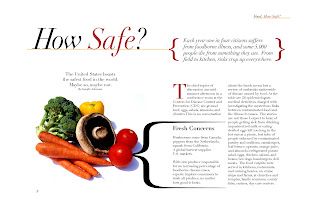
This is the poster for the magazine article on unhealthy food. I wanted to make it look like a clean spread that could be seen in an upscale magazine. 4 color, 11x17 bleed. I had a difficult time using such a small amount of type in such a large area.
Time: Brainstorming: 30 min, Typesetting: 2 hours Laying out: 2 hours
Revisions: 3 hrs
1st revision: 1 hr
2nd revision: 1 hr
3rd revision: 1 hr
Portfolio Submission 5:
This is a poster for National American Heritage Month. One color, specified. Black and white. 13x19. This is one of the first times I worked with a column grid. I enjoy the tag line and think that I executed the illustration well.
Time: Laying out: 2 hrs, Research/Brainstorming: 1 hr
Revisions:
1st time: 1 hr
2nd time: 2 hrs
This is the final Rapala spread. Bleed, 4 color. We were to create an advertisement emphasizing the benefits of using Rapala bait lures. I found the photography of the lures and the man holding the fish. I think this is a nicely executed layout.
Time: Layout: 2 hours Typesetting: 2 hours, Finding picture/photoshopping: 2 hours
Revisions:
1st time: 1.5 hour
Friday, October 9, 2009
RAPALA FINAL.
This is my final Rapala fish spread. I got a lot of help on the layout but I think it helped me better understand type layout and how to put in photos and layout each aspect of the spread. I think that I need to address each part, like the header, pull quote, picture, etc. separately so that I can get a better understanding of the space I have to work with. I like the lures up by the title. They are probably my favorite part of the spread.
Wednesday, October 7, 2009
Gouache Three Composition.
Tuesday, October 6, 2009
Ok this is the poster concept I came up with for the image assignment to take a picture we liked and incorporate it into a poster, magazine spread, and product advertisement. I came up with the idea for a gala at the aquarium. I wanted it to be elegant and fun. I had an issue with the type at the bottom. I think it needs to be refined and perhaps I need to put some more information on the bottom. So help please?!
DMV revise.
These are the refined rough sketches of the cartoon idea. He picked the middle one because he liked the expressions. I need to refine them yet again and these will be what we use to put color in and then refine the lines. I actually enjoyed this more than I though I would. Oh, what a rare, pleasant surprise.
Ok I'm not really sure why this turned out to be blue and purple but it's actually red and yellow. This is my first layout for the Rapala spread. I wanted the lure to look like he was casting. But I need some obvious revisions. Also, I think the guy needs to be bigger as well as the illustration refined. Should I try doing a picture or illustrate?
Subscribe to:
Posts (Atom)